Color
Just like a painter, a photographer has to be aware of the colors in a composition. Unlike a painter, a photographer doesn’t have complete control over the color in photography.
The color wheel can help us understand the colors in image. The color wheel can be very basic or can have very complex differences and can be consisted of millions of colors. It shows the relations of each color to other colors.
Three primary colors are yellow, blue and red. They form the basic color wheel. Three derived colors are green, purple and orange, and they are secondary. They are obtained by mixing the three primary colors. According to the traditional color theory, the colors across from each other are complementary.
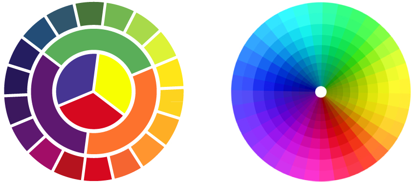
This means that they go well together. For example, red and purple are next to each other on the color wheel, and traditionally seen as opposed to each other. This is because purple contains red.
When a mixed color (or secondary) is placed next to one of its component colors traditionally, they are incompatible.
However, in photography, colors can act very differently. In photography, the colors placed in color wheel next to each other are often compatible colors while facing each other are perceived as opposite colors. The stronger the color, the stronger the effect of conflict arises.
For example, a deep purple come into conflict with a deep green more strongly than a pale purple and pale green will clash. The negative effects of clash of colors in the photograph are most often seen with artificial colors. When opposite colors occur in nature, they behave more like traditional theory of the color wheel.
Opposite colors
- Can overwhelm an image or object
- Can be used to draw attention to one part of an image
- Can be used to create a sense of discord in the image.
Neighboring colors
- Tend to merge and not overwhelm an image or object
- Can be used to connect two parts of an image
- Can be used to create harmony within the image
Choosing a color is hard enough, adding one or more colors to the mix can be intimidating.
Neighboring colors / harmonizing appear next to each other on the color wheel. Harmonizing colors often work well together but if too close in value, they can appear washed out or not having enough contrast. A harmonizing trio might be something like blue, light blue and cyan or maybe red, orange and yellow.
This image below is an example of similar tones, because there isn’t a particularly strong color that highlights an object, so practially, we do not know what exactly is the focus on the image. This of course, does not mean the poor quality of photo.

The complementary color of a primary color (red, blue or yellow) is the color you get by mixing the other two primary colors. So, complementary color of red is green, blue is orange and yellow is purple. Why are complementary colors important in the theory of colors? When placed next to each other, complementary colors make each other appear brighter, more intense. Photo below shows the relationship of two complementary colors – blue door and orange wall. Both colors are intense, so it is confusing to determine the focus of the photo. Complementary colors appear on opposite sides of the color wheel. While the contrast is often necessary to provide optimal readability (such as a high contrast between background and text) complementary colors when printed side by side may appear to vibrate and be very tiring for the eyes. The neutral grey soothes the composition and acts as a break between two intensive hues.

There are different influences of different kinds of colors
- Cool colors (calming): blue, green, turquoise, silver
- Warm colors (exciting): red, pink, yellow, gold, orange
- Mixed color hot/cold: purple, lavender, green, turquoise
- Neutral colors (unification): brown, beige, ivory, gray, black, white
Cool colors tend to have a calming effect. At one end of the spectrum, they are cold, impersonal, antiseptic colors. But on the other hand, cool colors are comforting and rewarding. Blue, green and white neutral gray, and silver are examples of cool colors. In nature blue is water and green is plant life – a natural, life-sustaining duo. Cool colors are smaller than warm colors and they visually recede on the page, so red can visually overpower and stand out over blue even if used in equal amounts.
Warm colors wake us up. The warmth of red, yellow, or orange can create excitement or even anger. Warm colors convey emotions from simple optimism to strong violence. The neutral black and brown also carry warm attributes. In nature, warm colors represent change as the seasons change, or the eruption of a volcano.
Colors with attributes of warm and cool colors can calm and excite. These are colors derived from a mixture of cold and warm color. Shades of purple and shades of green and beige colors are mixed bearing the color symbolism of both hot and cold sides of the color wheel.
Neutral colors, black, white, silver, gray and brown make good background, they serve to unify diverse color palettes, but also, they are often independent as primary object or design. Neutral colors can be cool or warm, but are more subtle than the blue and red. Neutral colors help to focus on other colors or serve to calm colors that might otherwise be overwhelming.
For one person at a time, red may appear light and cheerful, or warlike and aggressive. Perception of color also changes to your object/subject as compared to other surrounding colors. A green object can pass more yellow or blue depending on the color of the object next to it, or the color of the foreground and / or background.

I modified this photo in Photoshop to show the relationship of colors in the image. Here we have three dominant colors – two complementary – red and green and a neutral color. Neutral colors support the object, they give it boundaries and shape, moreover, they provide new quality to colors with giving it roundness and directions.
The color temperature
The color is produced by the rays of light reflected or transmitted through an object.
A beam of light is an electromagnetic wave, a part of the series of electromagnetic waves that travel in space, and is described by its wavelength and frequency. The wavelength is the distance between two corresponding points on the wave train, while the frequency is the number of waves passing a given point over 1 sec. Wavelength and frequency give the speed of the wave. The electromagnetic spectrum ranges of wavelengths 0.0000001 nm to 1000 km. What we call light is the visible part of the spectrum from about 400 nm to about 700 nm. It is a very small part of the electromagnetic spectrum. Ultraviolet (UV) radiation band is below 390 nm and infrared (IR) band above 760 nm.
However the photographic film is sensitive to a range of wavelength between 350 nm and 700 nm and therefore it is sensitive to UV radiation. For this reason, a UV filter is placed in front of the lens, to stop the UV radiation reaching the film. In digital cameras, CCD and CMOS electronic sensors are sensitive to infrared radiation. To eliminate the effect of infrared rays, a special filter is placed in front of the image sensor.


*All photos & graphics in this page are mine and I own the copyright. These texts were originally created for my work in photography course in French school in Belgrade. I wrote this text probably under the influence of other websites or books about photography and references can be found in the footer of each post.
References:
“Advanced Photography”, Michael Langford
http://photography.about.com/