Tonality
Tonality is the overall appearance of an image regarding to the range and distribution of tones and the smoothness of gradation between them. Tonality plays an important role in photography.
The color is produced by rays of light reflected or transmitted through an object. The lowest frequency (number of oscillation in a given point in time) creates a red light, and the highest creates purple. White light is an equal distribution of all visible frequencies. Rainbows and prisms split white light into the colors of the spectrum. What we call the black is simply the absence of light. The tonality can be understood with this three-dimensional example. It is the simplest representation, and most easy way to understand charts of colors. In fact, the color wheel is just a horizontal cut of this representation at the same intensity.
The Munsell system is a three-dimensional space, whose vertical axis carries:
- hue measured by degrees around horizontal circles (0 to 360 °)
- chroma (color purity, intensity), measured radially outward from the neutral (gray) vertical axis
- value (lightness) measured vertically from 0 (black) to 10 (white)

Tone is probably the most intangible element of the composition. Tone may consist shades of white, gray to black, or it may be contrasted – darkness against the light with little or no light gray areas – it is a common way to add a third dimension to a two-dimensional b&w image. The interaction of light against dark shades in various ways helps to create the atmosphere of a composition. An image composed of dark colors expresses mystery, intrigue, or sadness. When tones are mostly light and airy, the image represents brightness, joy and thoughtlessness.
Hue
Hue is the actual color. It is measured in angular degrees counterclockwise around the cone starting and ending at red=0 or 360 (ie yellow=60, green=120, etc..) Each horizontal circle Munsell divided into five main colors: Red, Yellow, Green, Blue and Violet, with five intermediate hues halfway between adjacent principal hues. Each of these 10 steps is then divided into 10 stages, so that 100 hues are given integer values. Two colors of equal lightness and saturation on opposite sides of a circle of hue are complementary colors.
Lightness
Lightness, or value, varies vertically along the axis, from black (value 0) at the bottom, to white (value 10) at the top. At 0% brightness, both hue and saturation are meaningless. Neutral grays lie along the vertical axis between black and white.Value (sometimes called lightness/tone) is a property of a color or size of a color space, which is defined to reflect the subjective perception of brightness of a color for humans along the lightness-darkness axis. The lightness of a color also represents its amplitude. Value is defined as the relative lightness or darkness of a color. This is an important tool for photographers by the way it defines the shape. Contrast of values separates objects in space, while the gradation of the value suggests a mass and contour of an adjacent surface. When the tones in the image have similar brightness, space loses its depth because the contrast is weak.
Chroma / Purity / Saturation
Chroma, measured radially from the center of each slice, represents the “purity” of a color (related to saturation), with lower chroma being less pure (more washed out, as in pastels). At 0% saturation, hue is meaningless. Saturation, measured radially from the center of each slice represents the “purity” of a color with less saturation being less pure (more washed out, as in pastels). Intensity is a property a color or size of a color space, which is defined so as to reflect the subjective perception to humans.
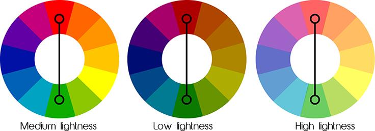
Here is an example of complementary colors, contrasting hues. They are on opposite sides of a color wheel – two colors of equal value and saturation. Here, brightness and saturation/ purity are the same. This means, the green has the same level of purity as red and they both are of the same intensity.
On the image below, picture on the left is a b&w version of the picture next to it, with a model in a red dress. On the first picture the focus is on the model’s face because its brightness separates it from contrasting dark background. Hands and face of model are also in contrast to the background being is equally sharp, but the dress is almost visually blending with the background. The following image shows a different situation even though it’s the same photo with the same tonal values, but with added saturation and hue. In this photo red dress dominates, the face is similar in tone to background, a green color (complementary to red) is almost rivaling the intensity of the red dress.
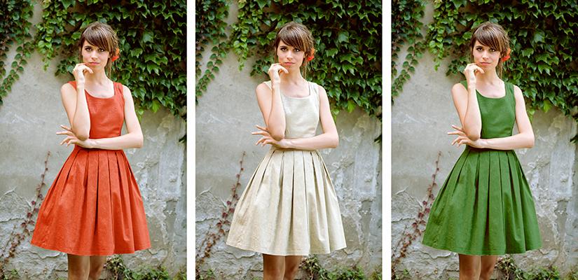
On the last picture, however, face and body of the model are almost merged with the dress, which is similar to shades of the background and, what comes into the foreground is creeper. To summarize: knowing these three color dimensions – Tone, Hue & Lightness is very useful in photography, especially when putting an accent to the detail and and improper handling them can be confusing for the viewer and can lead to completely wrong point of the image.
 In addition, there is yet another feature of the colors in photography that I’ve noticed, which is different from, say, the colors painted on canvas. When tones are dark on canvas, colors are more intense, more saturated, and when the image is generally light, when lots of white pigment is used, colors look washed out, less intense. It is quite the opposite in photography. Specifically in the photos for commercial use, such as, for example, photos of food, colors should be more intense, saturated, or to look tasty and delicious. To achieve this intensity, slightly overexposing photo is good way of letting the light to “pass” through food. The light in photography works in favor of the colors, unlike painting, because with inserting more brightness than the light meter shows, colors gains transparency, intensity and seductiveness.
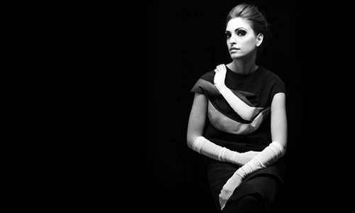
In black and white photography shadows and light can also play a huge role in creating a mood. A photograph with dark tones creates a somber brooding scene, while a photo with light tones seems to be more delicate and upbeat. In practice, dark photographs with lots of shadows, need lots of light, therefore long exposing time, although short exposing is good for obtaining contrasts. For instance, landscape photography in the morning or late afternoon, under a sunny sky will create dramatic shadows, and brighter images require clouds that soften and diffuse light which reduces shadows. Fog, mist and rain are all good candidates for light toned images because of the lack of shadows. As for contrast in the image, it directs the eye of the observer and it is located where there is no gradual transition of gray shades into brightness. Characteristic of backgrounds is that they are not contrasted, either due to the atmospheric perspective, either because of the lower sharpness or simply it has low contrast quality. Therefore, portraits, eyes, or wrinkles on the face, have the largest mutual contrast and draw our attention. Contrasts should be used carefully and only when they point to the center of interest. Otherwise, when there is plenty of contrast, we cannot focus on one or several objects and to determine the center of interest and, our interpretation can be very confusing.
Low value of photography brings contemplative or sad and depressing feeling, so it might be a means of using darker values to transmit these types of scenes or concepts. Photography with high value could convey more carefree or gay and happy feeling. Photography is not just a simple transfer of reality. Photo can transfer invisible elements such as emotions. Colors and tones help us a lot. Dark colors, dark tones reflect a feeling of pessimism, sadness, loneliness. Bright tones contribute to the emotion of optimism, happiness, satisfaction. It is not surprising that many ads use very bright colors. It is a subconscious tricks to force the viewer to want the product.
*All photos in this page are mine and I own the copyright. These texts were originally created for my work in photography course in French school in Belgrade. I wrote this text probably under the influence of other websites or books about photography and references can be found in the footer of each post.
References:
http://www.blur-magazine.com/
http://char.txa.cornell.edu/language/element/color/color.htm
http://nature-photography-central.com/black_and_white_photography_shadows_and_light.html
Marko Vulevic Photography


2 comments on this post